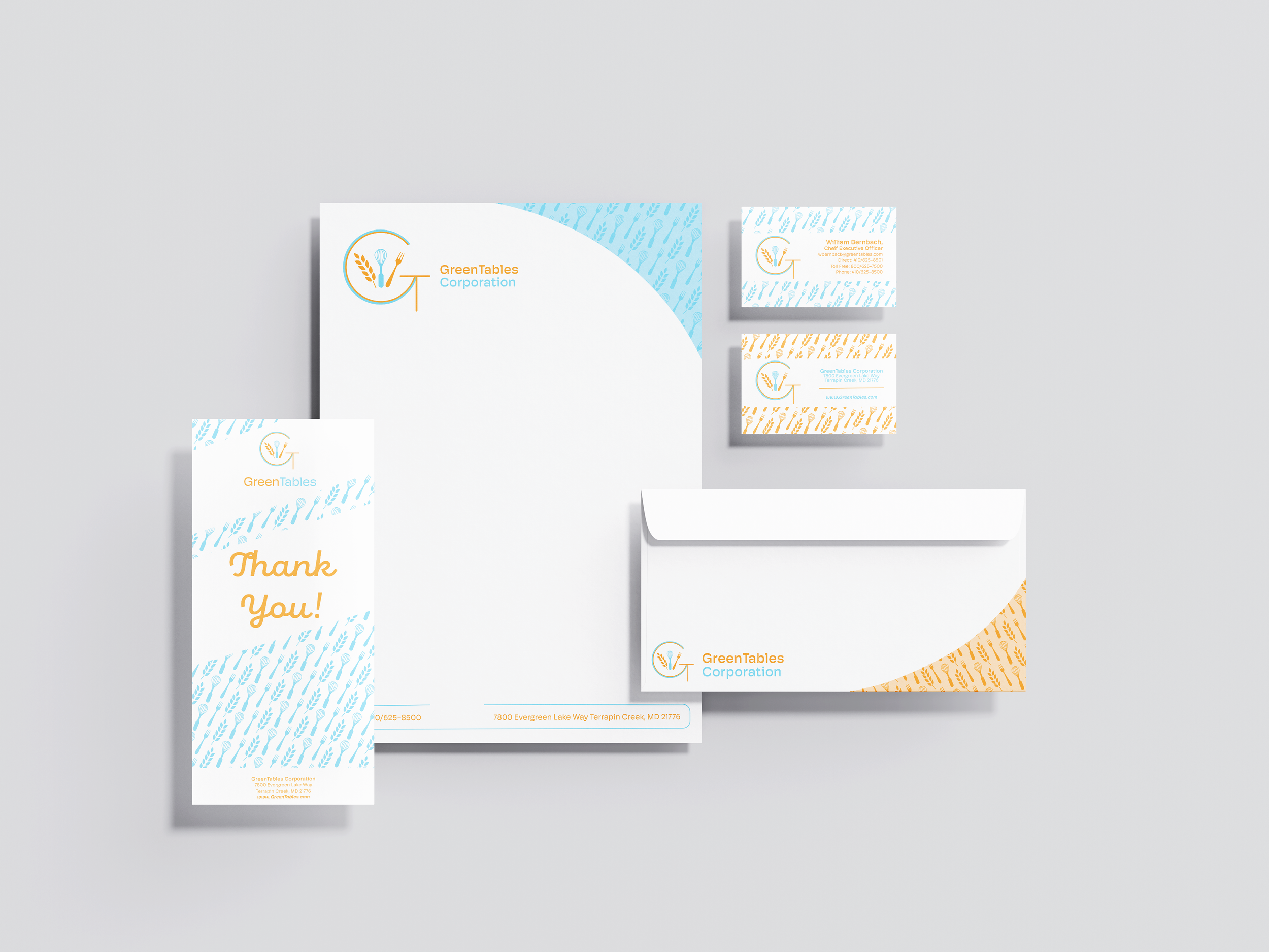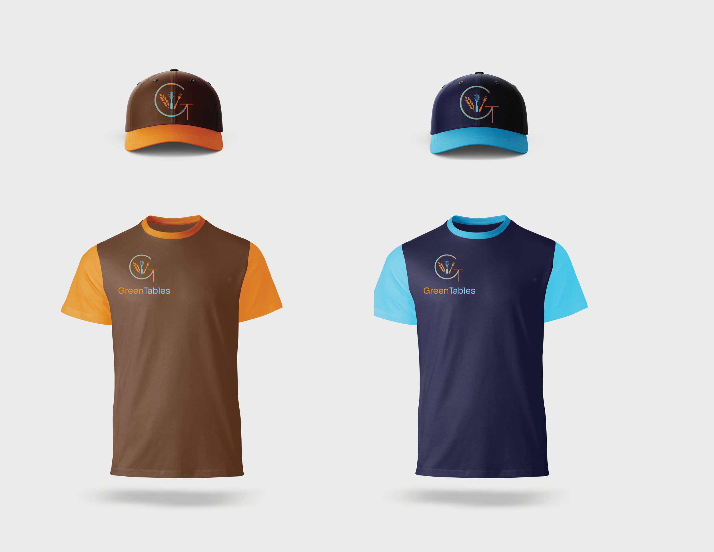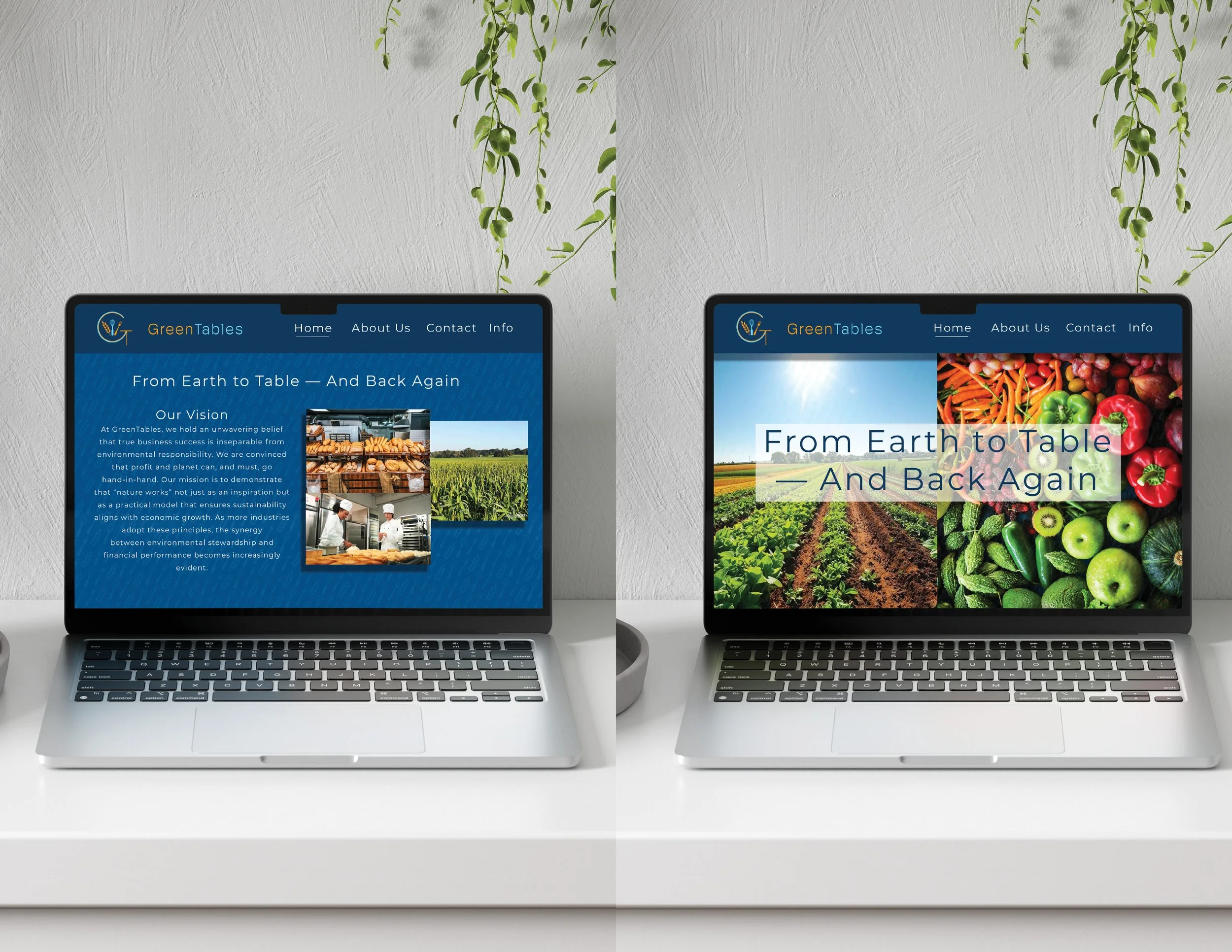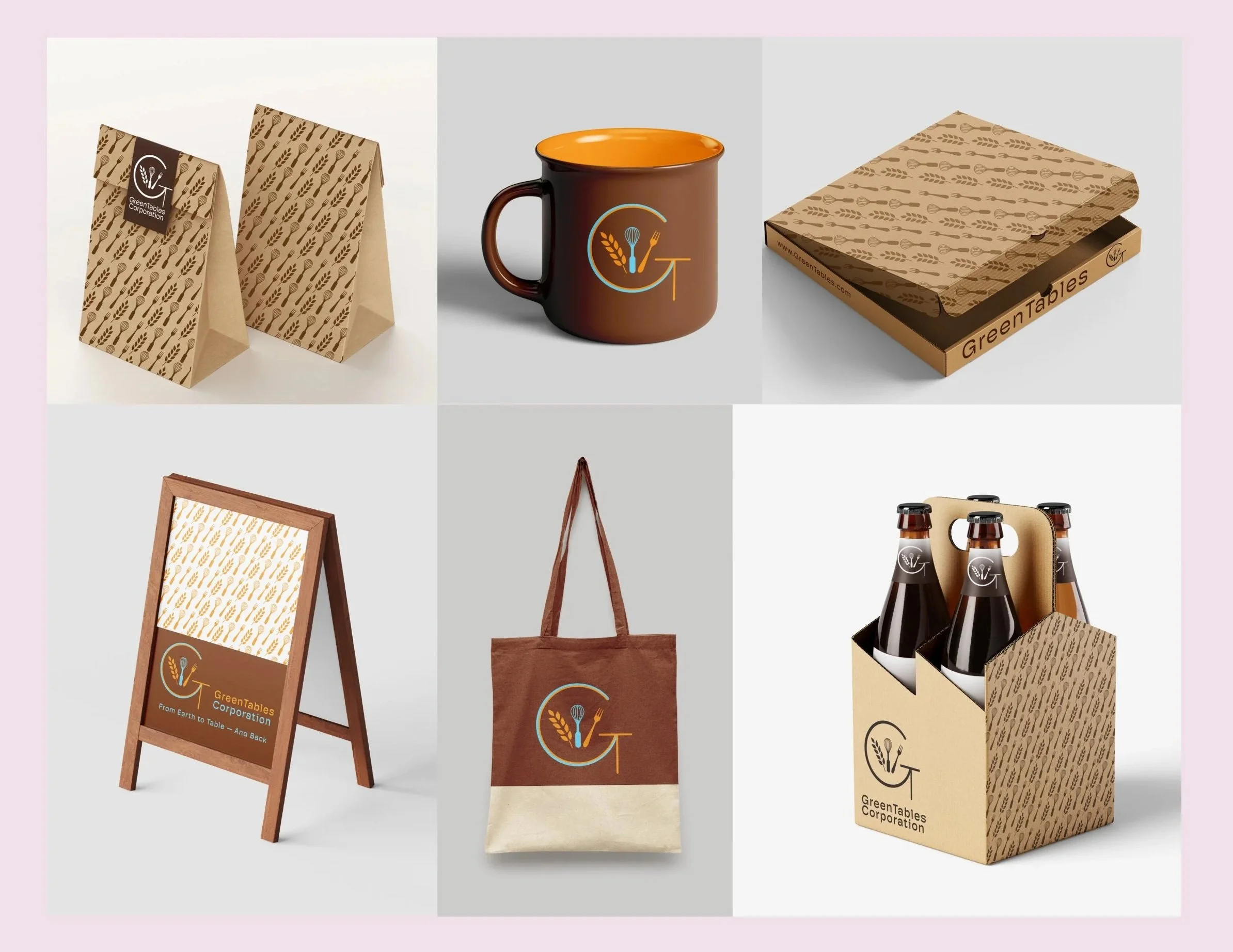
Branding, Stationary, and Brand Ephemera
goal
The goal of this project was to create a brand system representing the eco friendly company GreenTables.
Process
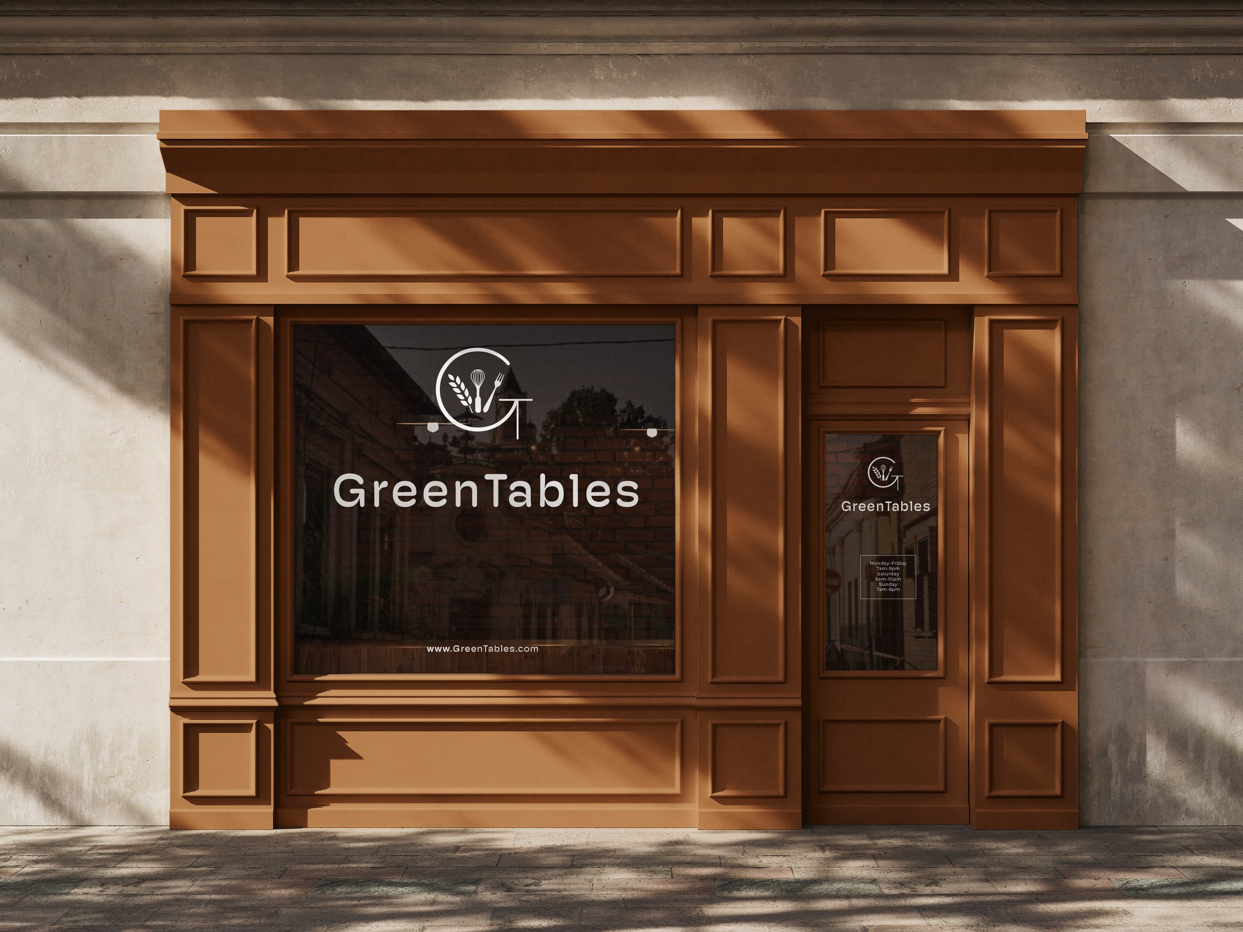
I designed the logo by combining both the g and t into one letter then to add more character I included a grpahic element of wheat, a wisk, and a fork in the middle to show the process of farm to table. From there I chose a light orange and blue as the brand colors since blue represents the sky and the orange represent the produce created from farming. The more difficult part was creating the brand ephemera including hats, shirts, bags, cups and much more, but after slow trial and error I was able to complete GreenTables brand system and I love the way it turned out.
Role
Research, Logo Design, Branding, Layout Design